Creative photography can sometimes involve combining several different techniques.
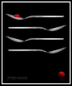
The award winning photo shown here originated with two simple spoon photos shot against a black background. The first was shot without the cherry, then the cherry was added and it was shot again.
To eliminate any surface reflection onto the spoon, it was hung by two thin strings. Those thin string lines were later removed in Photoshop and the resulting spaces cloned in.
Everything except the top two spoons was added in Photoshop. The spoon without cherry was copied and the two duplicate images placed in alternating reversed layers.
Because diagonal symmetry is an important element of composition, and because the eye is most comfortable traveling from the lower right corner up to the top left, something was needed to catch the eye and draw it through.
There is no more eye-catching color than red, so it was decided a cherry would be needed.
Rather than re-shoot, the cherry in the spoon was cut and copied from the original spoon shot, and then duplicated and flipped to create two halves of the cherry. The top and bottom halves were then merged into one layer and shaded to appear whole. The highlights were rearranged a bit to vary the highlights from the original. But if you look closely, you can see that one dash-shaped highlight is identical.
The copied cherry half was also flipped vertically and used to create the “reflection” …so it appears to be sitting on a shiny black surface. The signature was also flipped and the opacity strongly reduced to appear as a reflection, strengthening the illusion of surface.
A simple frame was created to house the entire affair.
This photo offers many creative photography ideas you can use to create your own beautiful artworks:
Simple elements: A spoon and a cherry. Photos are often made too cluttered. When the eye is made too busy, or doesn’t know what to look at, it loses interest quickly.
Three: Is a great number to remember in photography. There is the Rule of Thirds, whereby you imagine a grid, like a tic-tac-toe board, across your image. You then have a top zone, middle zone, and bottom zone. 3 horizontal zones to organize your photo. For example, if you were shooting a sunset you would want the horizon to be along the top line of your tic-tac-toe board, or at the bottom line. You would not want the horizon to be dead-center in your photo. You also have three vertical zones, left, center, and right. Good composition usually avoids placing your focal point (or main subject) into the dead-center area. Here in this photo, THREE COLORS were used, black, white and red. If you’re going to shoot a still life, consider using three object in the scene.
Diagonal Lines: Diagonal lines work well to draw your viewer’s eye through the photo. Here, the two cherries were used to create the diagonal. You could use a walkway, or trees, or a tabletop. A dock or the water’s edge can create a nice diagonal in beach scenes. A street in a cityscape. Either diagonal can be used, but as a preference, our eye prefers to travel from the lower right corner up to the top left.
However, like most rules, they are made to be broken.
It is often the very breaking of these rules that creates interesting photography. But it is wise to learn and practice the proven rules before trying to break them successfully
Competitions are judged by a very rigid set of rules that participant would do well to follow if they expect to win. Bold colors win. Simple designs win. Accepted composition forms win.
Artfullness and originality win out over the basics only when done exceptionally well. The safer road to competition victories, and great photographs, lies in following the proven to guidelines.
Adding these three magical powers…Simple Design…An Element of Three…and Diagonal Lines of Interest will greatly enhance your photography.
Check out this great new resource if you’re ready to get started with some of your own simple trick photography and special effects…


