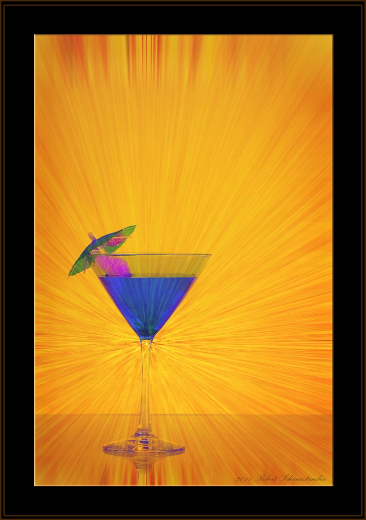
 As photographers, our task in every photo is to share our vision with the viewer.
We want them to “get” what we’re taking a picture of. Good photos tell a story. Good photos have a main subject.
There are several tricks and devices we can use to draw our viewers attention to just the areas we want. This photo uses two: contrasting colors (yellow and blue) and lines.
Designers and interior decorators always come up with the most amazing combinations of colors.
Me? Not so much.
But a great trick I found is available to everyone online. Created for webdesigners, this site shows over 200 color combinations using my favorite design number, “3″.
Three is good.
- Three colors.
- Three objects.
- Three zones in the Rule of Thirds.
For good designs 3 almost never fails. Here’s a link to the website:
http://www.webdevelopersnotes.com/design/color_combinations.php3
Another big plus for this site is they list the 6 digit color codes so you can plug them right into your Photoshop color palette if you need to change or add something.
Now, you can easily choose colors combinations for backgrounds, clothing, objects, etc.
But what I really wanted to focus this post on was how to create the “rays” that lead the viewer’s eye right to your subject.
Fortunately, it’s easy!
We use Photoshop Filters.
If you have no background image yet, or wish to play, you can use FILTER > RENDER > CLOUDS as a base. If you already have an image open, simply duplicate the layer and use that. However, Monotone colors won’t work. You will need some light/dark contrast present to create “lines” the effect
Step 1: Go to FILTER > PIXELATE > MEZZOTINT and from the drop-down menu choose “Short Strokes”. Your photo will now look like a scratchy, noisy mess. That’s OK.
Step 2 : Go back to Filters and this time choose FILTER > BLUR > RADIAL BLUR. Select ZOOM and BEST, then move the slider to maximum right. Next, click and drag the preview window and you’ll see that you can control where the blur originates. In essence, you control the “funnel” that draws the viewer into your photo by properly positioning the “cross-hairs”. This blur will create the lines that your views eye will follow. It’s a great creative trick for focusing attention on just what you want.
When you have it positioned where you think it will work, press OK.
Step 3: This step is really up to you depending on your photo. Since you’ve built this creative focus element on it’s own layer you can change it to suit your needs. Some options would be:
- Go back and do over to better position the cross-hairs
- Soften it by running the same sequence again
- Use EDIT > Fade Radial Blur to create less of an effect
- Change the layer’s BLEND MODE for different effects
- Place this layer OVER or UNDER existing layers different effects
- Use a Layer Mask to put objects in front of or behind the blur
- Change the layer’s color with a Hue/Saturation adjustment
- Use Edit > Transform and Free Transform to customize
Experiment! Have Fun!
The possibilities are endless!
Use this cool trick anytime you need a little extra help in getting your viewer’s eye to go right where you want it. These radiant lines will do the trick every time!
Hungry for even more creative photography tips? Here’s a new guide with a full buffet of simple creative tricks and special effects you can use right now…


